“Those who tell the stories control the world.”
- Hopi Proverb
About the Writer
I started storytelling as a child in the desert of New Mexico, where my closest friends were rattlesnakes and shooting stars. As an adult, I enlisted in US Army Intelligence in 2006. During the Global War on Terror I served as a Foreign Signals Collection Specialist -- which in reality means I decoded the secrets enemy computers whispered to each other. After three years of excellent conduct, I was selected to attend the United States Military Academy at West Point in 2009. I spent two years thriving as a cadet but I felt a greater pull towards my creative passions, so I congenially parted ways with West Point to pursue a career in writing.
I received an MFA in Screenwriting from Brooklyn College in 2019, and I am an active member of the Writers Guild of America East. With my unusual life experiences and my unique view of the universe, I have developed a body of creative work that is both quirky and appeals to a large audience. I focus on expressing progressive philosophies through the combined lenses of science-fiction, humor, and drama.
I live, breath, and survive through my writing.
Master of Fine Arts / Screenwriting / Brooklyn College / 2019
Bachelor of Arts / English / University of Mississippi / 2016
Associate of Arts / History / Santa Fe College / 2013
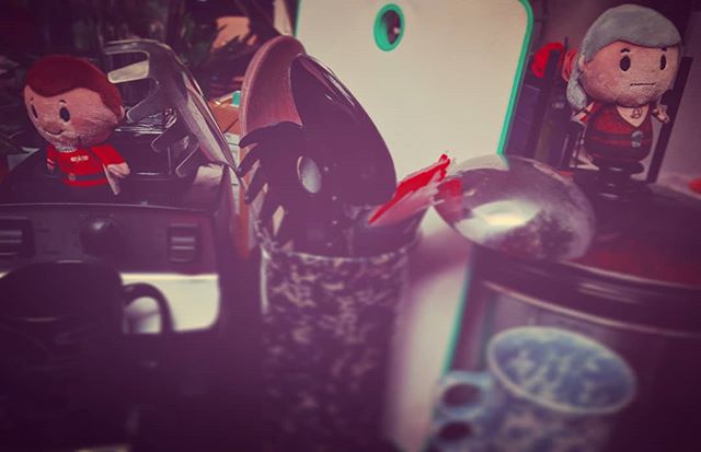
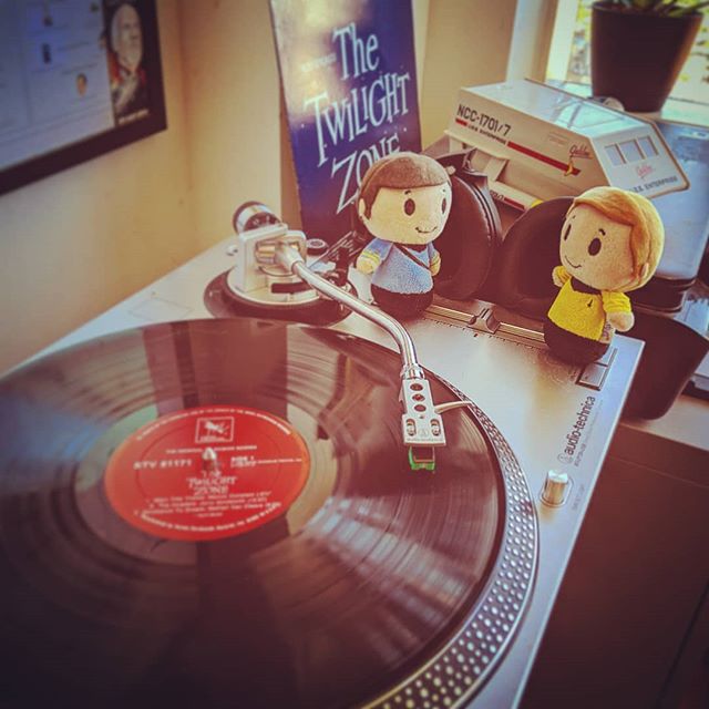
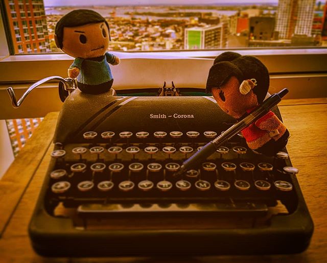
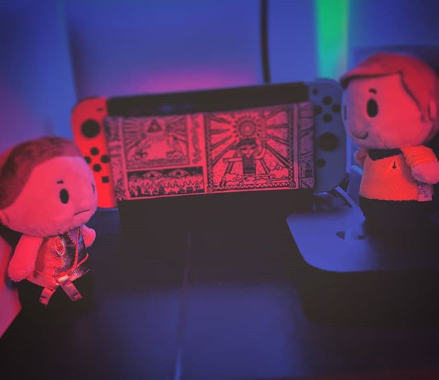
Philip is also the mind behind the Itty Bitty Away Team.


Social Media
Vimeo
To see reels send a message below to request video passwords.